.JPG)
Being in close proximity to New York with all its museums is one of my life's greatest gifts. I love to just walk around this wonderful city and capture images that I come across during my meanderings. I have a collection of these impromptu photos taken on the streets, in the museums and of the people of New York. I want to share my latest additions here...
Today I was in the city with my husband and while he met with a friend, I had two hours to myself... so I ran into MOMA to just wander around and see what chance encounter I might come upon. As I strolled aimlessly enjoying the midweek not-so crowded halls of MOMA, I zoomed in on an exhibition that captured my interest - New to the Print Collection: Matisse to Bourgeois. This turned out to be a selection of the latest additions to their print collection in a gallery on the second floor of the museum. I walked around, enjoying the art works and recorded the works that most appealed to me. So, here they are, my pick from MOMA's new additions to their print collection with their gallery labels...
 |
| Pablo Picasso, The Weeping Woman, 1937 Drypoint, aquatint, etching and scraper |
 |
| Henri Matisse, Emma's Face Turned to the Left, 1915 Monotype on chine colle |
 |
| Kathe Kollwitz, Self-Portrait, Hand at the Forehead, 1910 Etching and drypoint |
 |
| Kathe Kollwitz, Frontal Self-Portrait, 1922 Woodcut |
 |
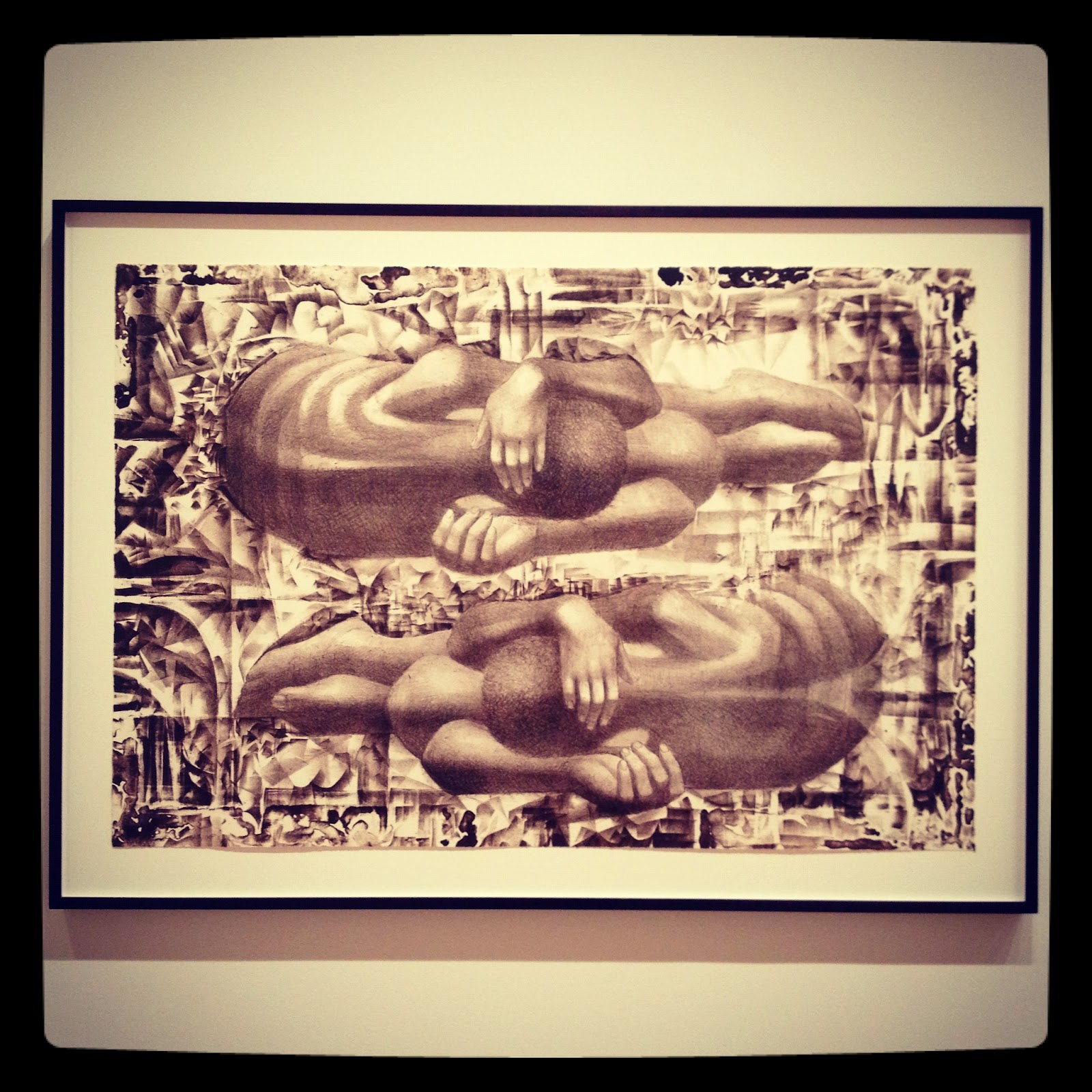
| Kathe Kollwitz, Self-Portrait, 1934 Lithograph |
"In these searing self-portraits, Kollwitz homes in tightly on her face, isolating her careworn features and grave expression. Brooding introspection permeates Kollwitz's oeuvre, which is, at its core, an expression of compassion for her fellow man, especially, for the suffering of women, children, and the poor in Germany during the cataclysmic years before, during, and after the two world wars. She dedicated herself to printmaking, believing that it was the medium best suited to social and political commentary. Self-portraiture was an important recurring subject in her oeuvre, and these intense, almost confrontational images are particularly powerful examples. The woodcut and the lithograph, acquired in 2012, joint he etching, already in the collection, to create a dramatic group of self-portraits from three different decades in three different mediums - each of which, in its own way, conveys the force of the artist's self-scrutiny over the course of her career."
 |
| Charles White, Untitled from Wanted Poster Series, 1970 Lithograph |
 |
| Charles White, Solid as a Rock (My God Is a Rock), 1958 Linoleum Cut |
"Chicago-born artist Charles White created the linoleum cut Solid as a Rock (My god Is a Rock) in 1958, shortly after moving to Los Angeles, where he became an influential teacher and mentor for an emerging generation of African American artists. The print's unusual scale and iconic depiction represent a key moment in the artist's practice - a transition between his earlier social realist work with the Works Progress Administration (WPA) and his increasing focus on issues of race and the black body.
White believed that art could be a weapon to fight inequality, and he understood printmaking's potential for spreading ideas and images widely, something he had learned at the WPA and at the revolutionary printshop Taller de Grafica Popular in Mexico City in the 1940's. The lithograph on view here, made in 1970, was among the first of White's works to be collected by MOMA. It is part of his Wanted Poster Series, portraying African Americans against abstract backdrops based on pre-Civil War posters advertising slave auctions and rewards for runaways. Recently, White's prints have become an acquisition priority, recognizing his significant engagement with the medium and the widespread impact of his work on a younger generation."
 |
| Louise Bourgeois, I See You!!, 2008 Just Like Me, 2007 |
"The strikingly vertical format of these prints, created in successive years, reflects the experimental approach Bourgeois took with the New York publisher Ben Shiff, who worked with the artist from 1989 until the months just prior to her death, in 2010. In the later years, Shiff selected etching plates close to the width of the table the artist used for drawing in her home; Bourgeois was able to work on different sections of a plate while seated. for these editions of etchings, she selected impressions with smears and tonalities created as the ink was wiped onto the plate before printing. Like many of her prints, books, drawings, and sculptures, these compositions present the fragmented body, sexually ambiguous and from a feminist perspective..."
 |
| Jaspar Johns, Flags I, 1973 Screenprint |
Details of Jasper Johns Flag I, 1973


"Johns collaborated with a group of Japanese master printers at Simca Print Artists, New York, to produce this elaborate screenprint - one of the artist's first. It is unusual in its avoidance of the large areas of flat color that often characterize screenprints. Like John's iconic flag paintings - built up with layers of encaustic (a waxy paint), newspaper scraps, canvas, and wood - this print was assembled through an extensive process, involving thirty-one separate screens printed in succession in fifteen colors. Of his work, the artist has said, "I am always interested in the physical form of whatever I am doing and often repeat an image in another physical form just to see what happens." With more varied marks, brighter colors, and a layer of varnish on the right-hand flag, the work offers two simultaneous interpretations of the same subject..."
And to my utter delight I discovered these surprising works by one of the greatest American icons...
 |
| Andy Warhol, Sunset, 1972 Portfolio of four screen prints |
"Warhol made Sunset, a commission by the architecture firm Johnson & Burgee, to decorate the landmark Hotel Marquette in Minneapolis. Four hundred seventy-two of the prints were used in the hotel, while 160 were assembled into forty unique portfolios of four prints, one of which is on view here. Warhol made all the prints using three screens - one to apply the background bands of color, one for the sun itself, and one with a single-color dot pattern. He inked the screens in various color combinations and printed them with varying registration to create 632 unique screenprints. Portfolios of Sunset are rare today..."

Thanks for this selection, Sedef! I'd never heard of Charles White, and I'm totally blown away by his prints that you posted -- I need to know more! Also love the Warhol prints -- I'd never seen them, either, and they remind me that as tired as I am of Warhol, I should look at some of his lesser known work. Thanks for sharing -- great way to start the day!
ReplyDeleteGood morning Karen,
ReplyDeleteI think I wouldn't mind waking up to these Warhol prints myself.
I must admit these prints were a pleasant surprise for me too...
A lovely account of your gallery experience, Thank you.
ReplyDelete